Design Rationale
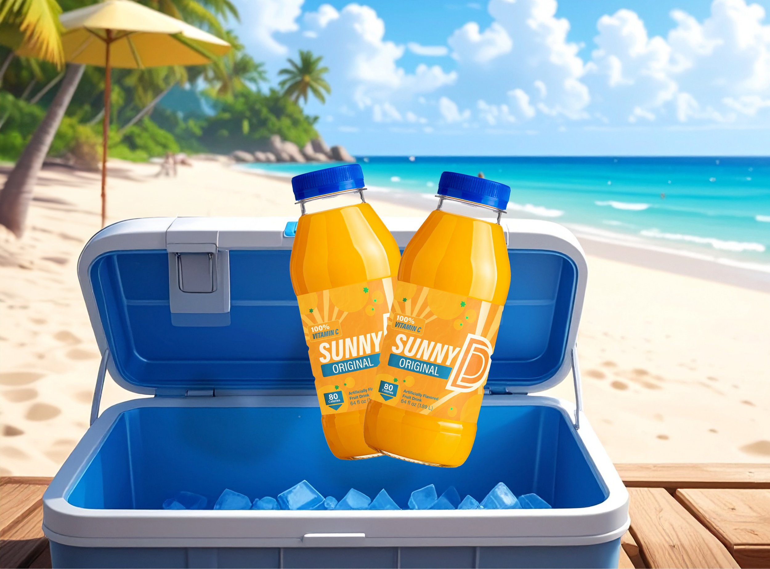
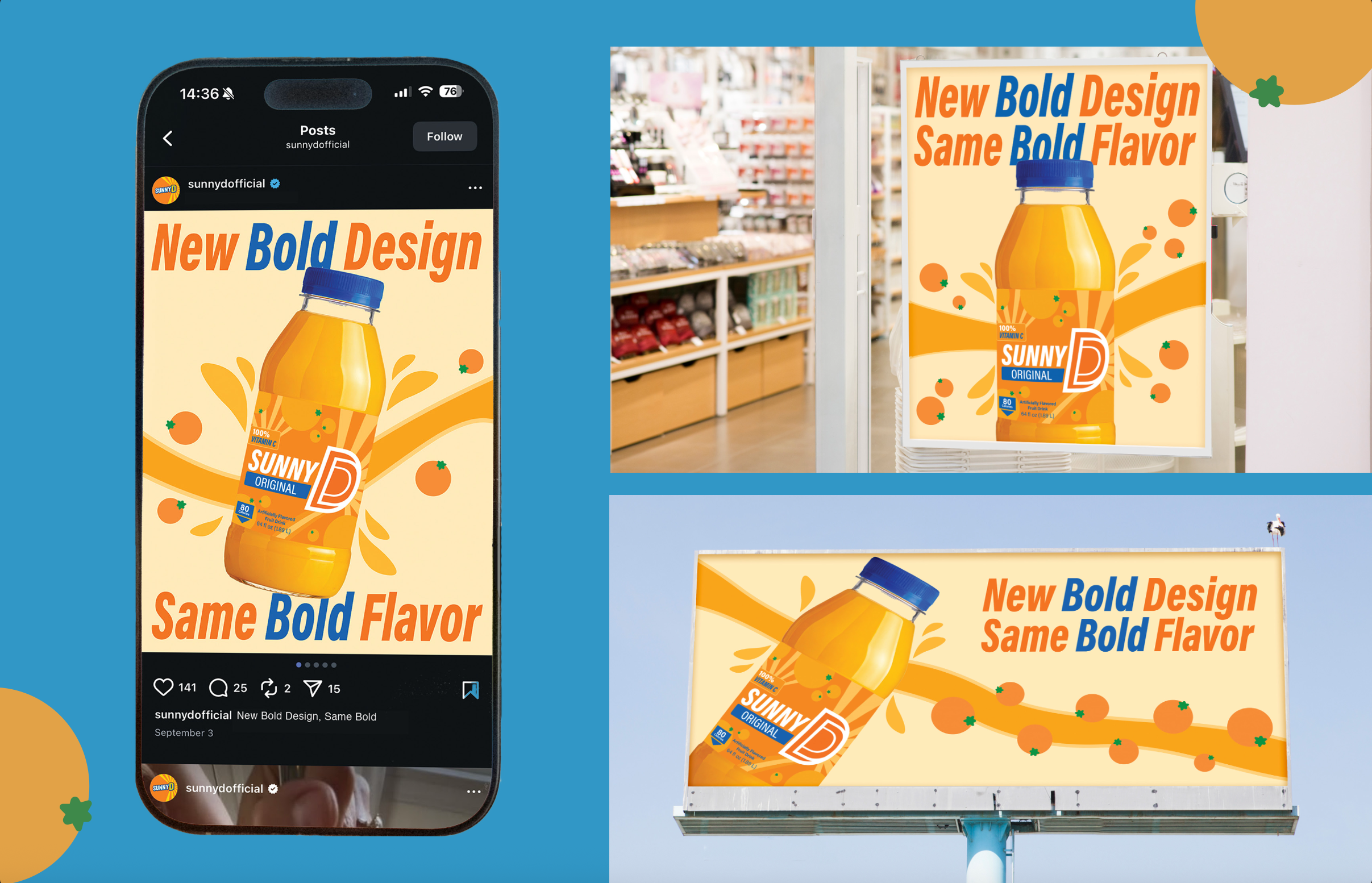
For this project, I redesigned Sunny D’s package and logo. I wanted to create a newer, modern label with a flatter, bolder design to help market to the younger generations. I used a bold, italic, sans-serif font to grab the audience’s attention and designed the new logo to include a more dynamic D shape. I created an orange shape to reflect the orange taste of the drink and arranged them in a nice, clean, and simple pattern that helps it pop out on the shelf.
View case study: here